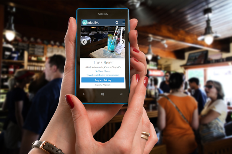
Eventective estimates that about 25-30% of the nearly 1 million visitors to Eventective.com monthly are browsing the site with their mobile phone or tablet. Is your site optimized for mobile viewing? Let’s discuss the 5 things you need to address on your website to ensure you are not losing 30% (and more each day) of web viewers.
Adobe Flash – Flash-based websites are beautiful when fully rendered on a computer, but less than half the mobile devices in use today can display the technology. Furthermore, Flash is no longer supported by Android, iOS (Apple) and Blackberry devices, which means, any Flash content you have on your site is useless to your mobile users. HTML5 is the standard technology and therefore the best solution for displaying your website in mobile browsers.
Large Images – Photos are essential for almost any website, especially in the event business. However, large images are not effective for mobile users. They can be difficult to see and navigate when the image is larger than the screen. Large files can take a long time to download and cost the user money on depending on their data plan. It’s best to limit your images to thumbnails that the user can expand if desired, and to keep file sizes to no more than 20KB.
PDF Files – Similar to large images, PDF files also create a challenge for mobile users. PDF files typically require bi-directional scrolling to read on a mobile device. It’s very difficult to read a document when you have to move the page back and forth as well as up and down. There are mobile PDF readers that wrap the text for you, but you cannot assume that your visitors will have this reader loaded on their phone. It is best to have your menu or pricing information in HTML format for easy reading on mobile devices.
Hidden Pricing – A good (full) website should be designed to engage your consumer. It tells each visitor all about your business in great detail allowing them to drill down for the information that they want to find. The mobile user is not interested in drilling down, they want all the pertinent information right at hand. Hiding pricing information on subsequent pages is counter-productive. Post your prices right on your main page.
No Call to Action – The goal of any website, full or mobile, should be to connect your customers with you. If your site is simply an advertisement with no way for the customer to contact you, it does no good. Make it simple for the user to contact you. Post your phone number clearly and use click-to-call functionality that instantly connects their mobile phone to your business. Post your location and integrate it with the mapping application on their device.
In general, for mobile users, less is more. Be sure to put the most important information, like your logo and contact information, at the top of the page. Organize your layout in a single column so that users only scroll in one direction. And get right to the point, make it easy for the user to contact you or find your location. Link to your full website for those who want to explore more.
